
Futura PT for Title and display, Proxima Nova for Body. These fonts were chosen to maintain a sleek and modern feel in the design
For the layout grid, a 10pt grid with 20 Margin was chosen, primarily to give creative freedom towards utilizing the available space
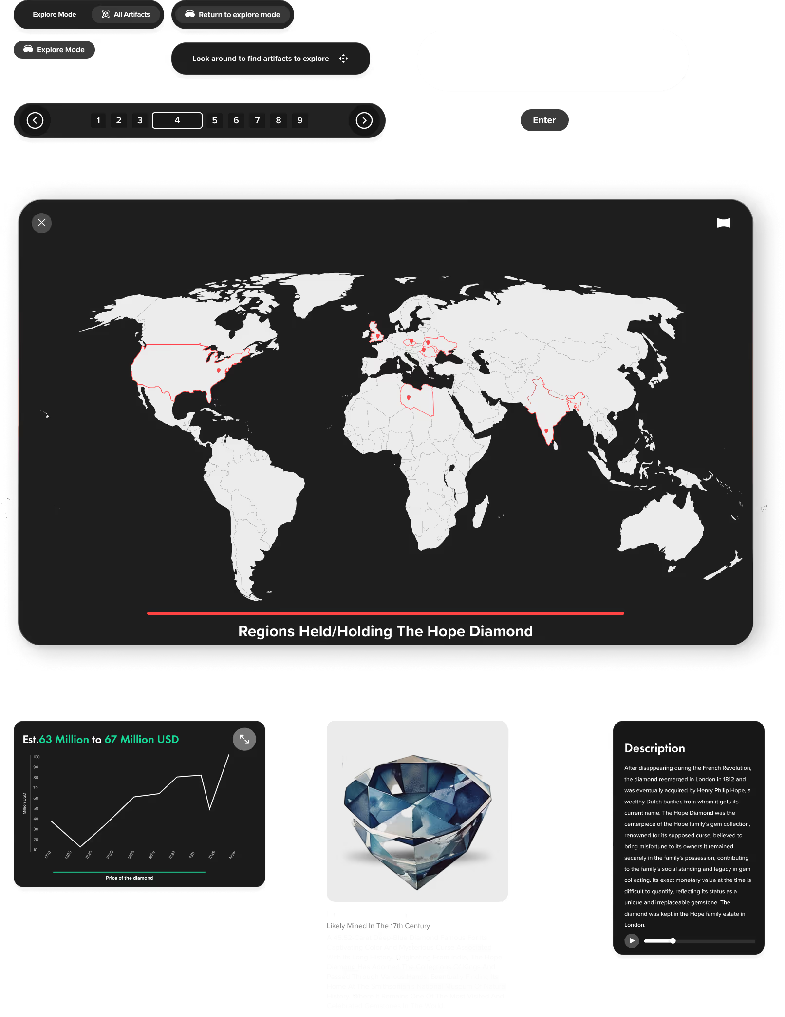
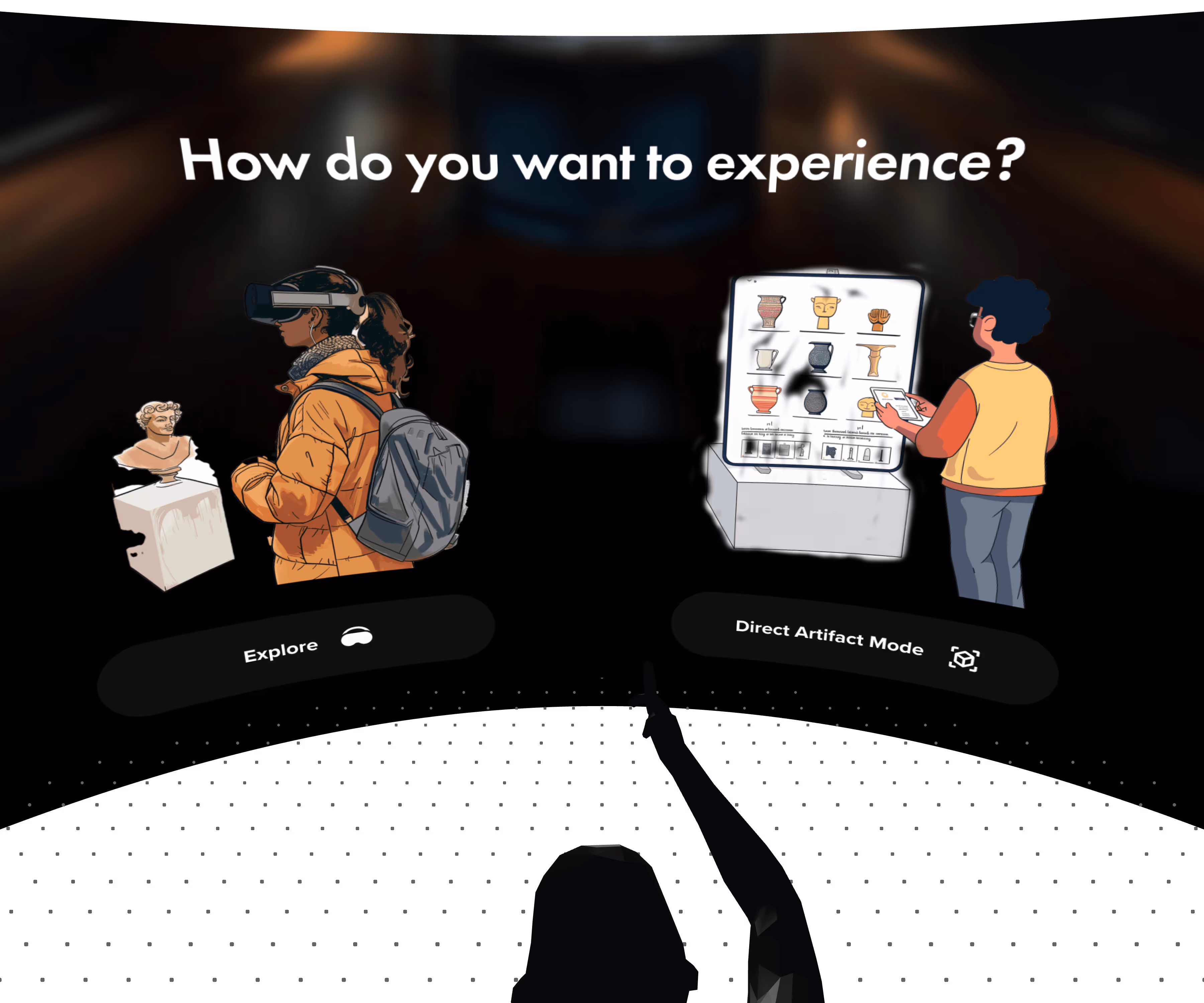
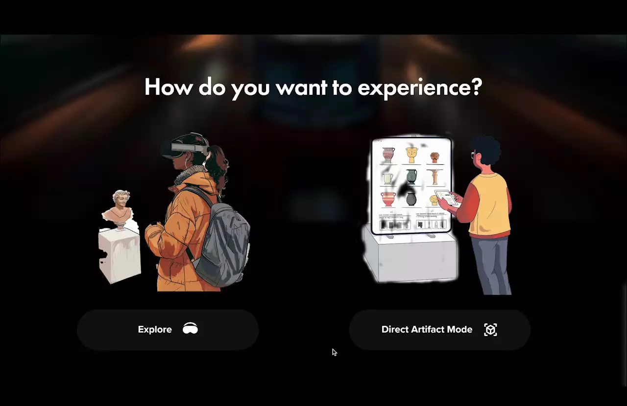
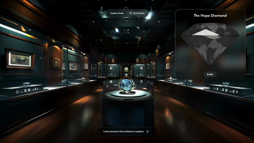
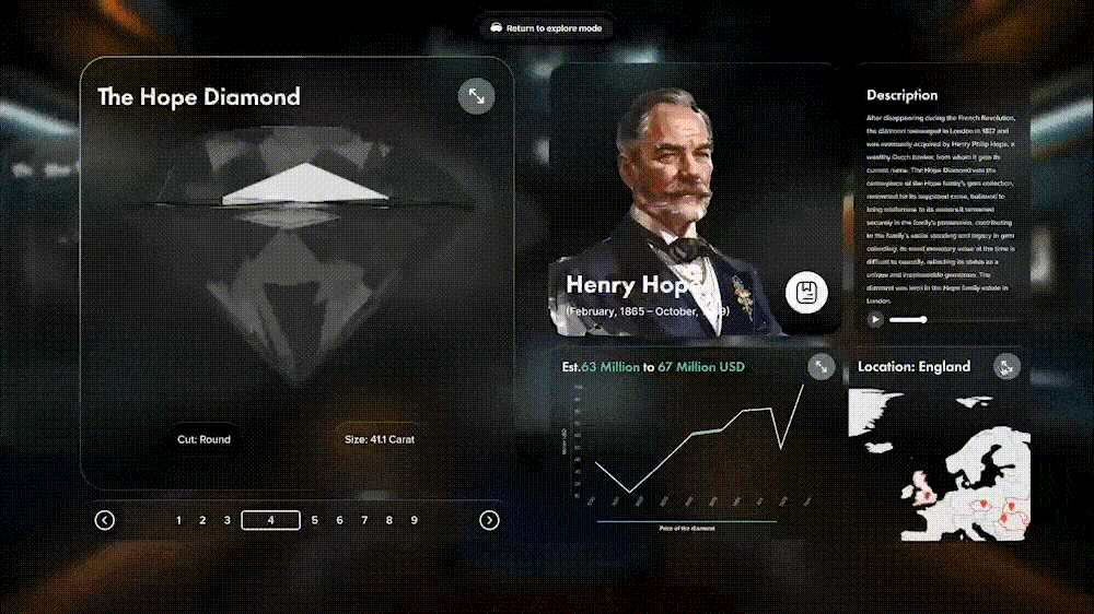
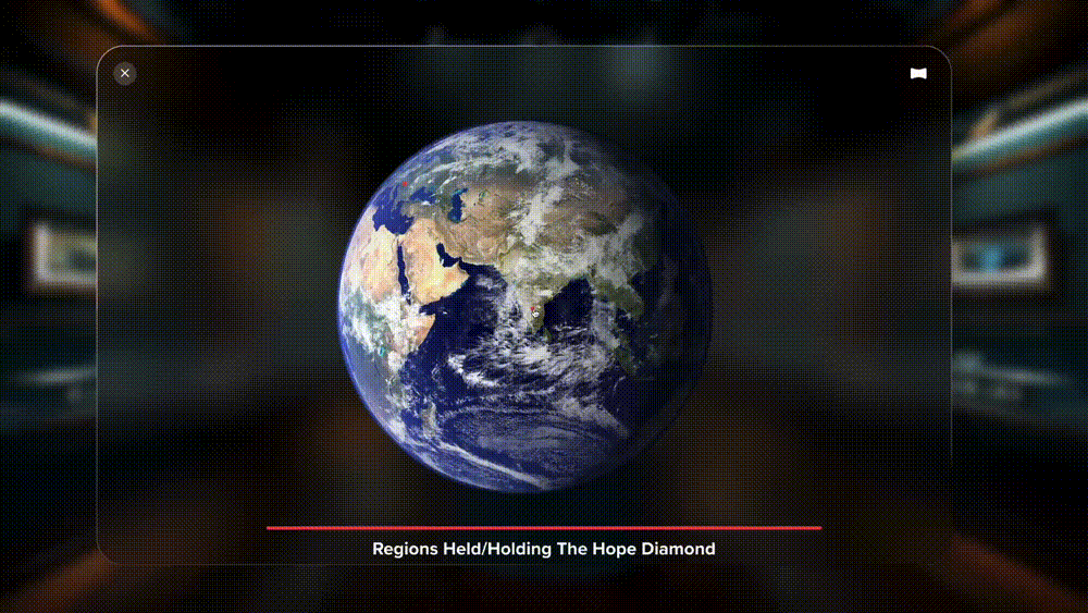
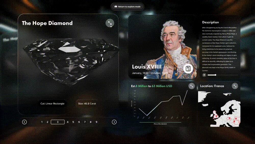
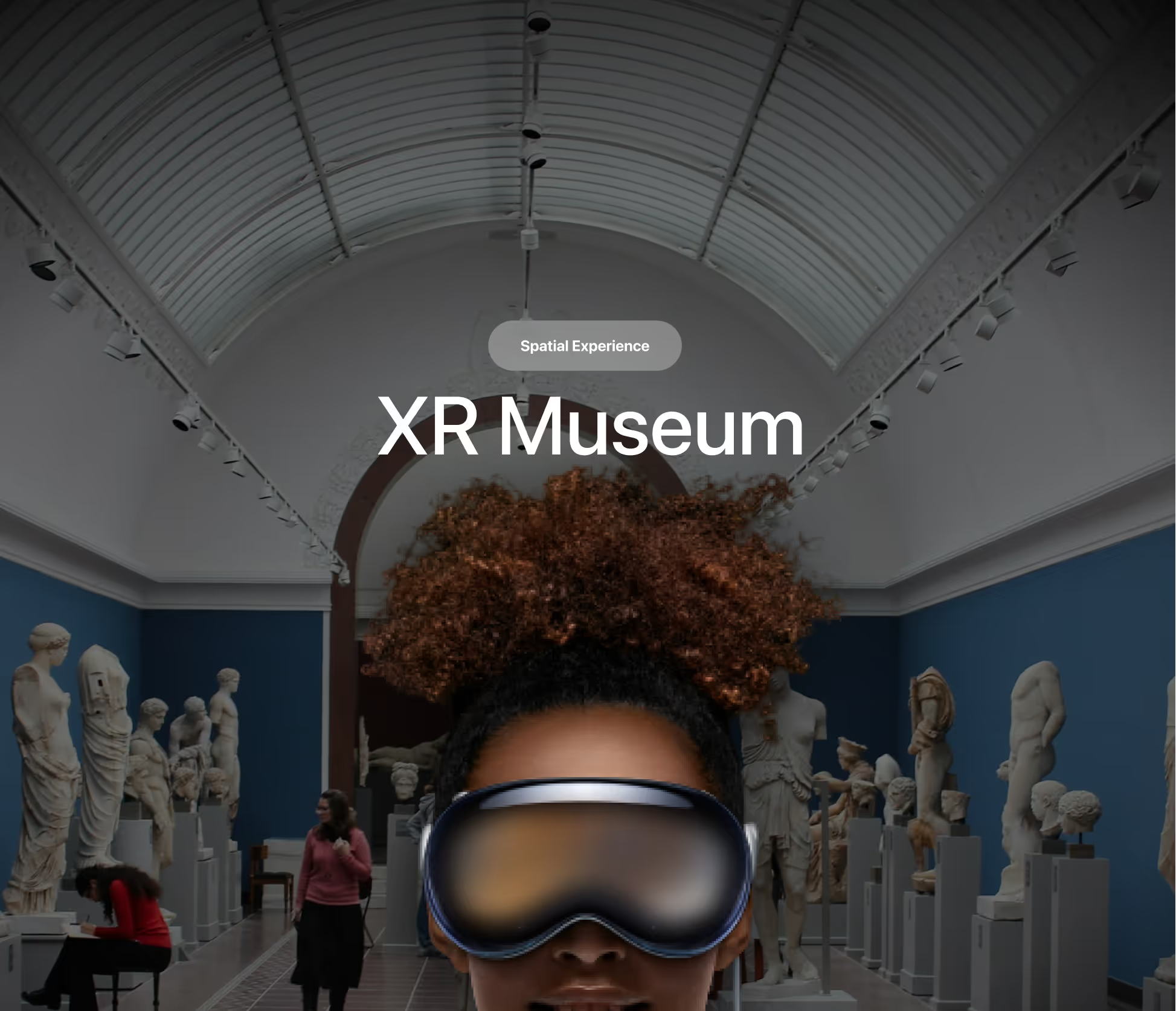
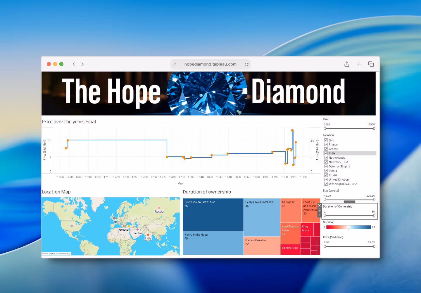
Glassmorphism was employed to create an immersive visual experience, leveraging depth and translucency to enhance the mixed reality environment.
To ensure optimal legibility, the design incorporates larger and thicker fonts, carefully selected for clarity and ease of reading across diverse museum extended reality setups.
Further refining user interaction, enhanced contrast was applied, particularly to buttons, in response to the received critique.